One of the most interesting aspects of developing a company brand is choosing your colours and logo. But have you thought about the implications of your choices when marketing internationally? As an exporter it’s important to be aware that language and culture influence perceptions of and attitudes to colours. It will serve you well to choose your colours wisely.
Did you know..
- Purple is associated with sorrow and death in Brazil
- Green is associated with religion in Islamic culture
- Yellow is associated with courage in Japan
- Pink is associated with trust in South Korea, while in the UK, US and Western Europe blue is the colour of trust.
- Red and white combinations should be avoided in many cultures (particularly in floral displays) because they’re associated with funerals or death.
There is a science to choosing the right colours since attitudes to colour are deeply seated in culture, affected by many factors such as: religion and spirituality; climate, seasons and attitudes to the nature and the environment; and political symbolism.
So what should we do as exporters to ensure our brands, marketing and advertising send the right signals to potential buyers and customers?
Words alone are not enough
Do market specific research into attitudes towards certain colours. This will have implications for your branding, packaging and the colours used in your website and other marketing.
Be aware that product descriptions that include translation of colours or even flavours can be a very tricky business e.g. imagine the various interpretations that could be made of terms such as ‘aquamarine’, ‘orchid pink’ or ‘fruits of the forest’ depending on cultural reference points. Translation should always be done by a professional translator who is a native speaker of the language you are translating into. Translators should be given the visual form of the colour to work with e.g. fabric or paint samples – words alone are not enough.
Imagery should also be chosen carefully – for example, flowers of certain colours and types and numbers can be associated with good or bad fortune – I wrote about this in an earlier post
Check how colours might be interpreted in other cultures – some of the basics are covered below. If you are an exporting company you can also consult a UKTI Language and Culture Adviser.
Red
While red is associated with passion and power in the West, in the East red is associated with joy, luck and happiness. In the Middle East there is a greater association between the colour red and danger, caution or even evil.
Orange
Orange is considered to be a positive colour in most cultures. In the West it is often associated with harvest time and warmth and in eastern cultures with courage, love and spirituality. It is the national colour of the Netherlands.
Purple
Purple is considered to be an honourable or royal colour and represents wealth in many cultures but in Latin America and Brazil is associated with sorrow and mourning.
White
White is associated with purity, peace, serenity and weddings in many cultures, but with death, funerals and misfortune in others such as in many parts of East Asia.
Black
When it comes to black, interpretations across cultures share a sense of darkness, sadness, finality, magic and mystery. In the Middle East black can represents rebirth as well mourning.
Yellow
Yellow stirs mixed emotions. It stands for new life and cheerfulness in many parts of the Western world and the Middle East. In Japan it’s associated with courage while in India with commerce and trade. It has a negative side though being associated with envy in Germany and mourning in Egypt and parts of Latin America.
Green
Green is associated with new life, nature, the environment and good luck in many parts of the world. In some cultures green can be associated with infidelity – in China wearing a green hat signifies cheating on your spouse. In parts of Latin America green is also associated with death. It is the national colour of Ireland and the colour of Islam.
Blue
Blue is common in the colour palette of Western European and North American businesses because it is associated with trust and authority. It can also be associated with sadness and in Latin America even mourning. In many Eastern cultures blue represents immortality, strength and is considered to be a feminine colour.
Is it yellow, green or blue?
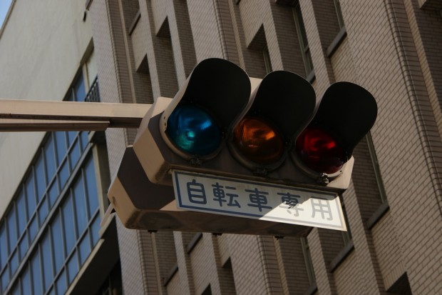
Did you know that all languages do not distinguish yellow, green and blue in the same way and (certainly historically) may not even have different words to distinguish between green blue or green/yellow? If you have visited Japan you may have noticed that the traffic lights appear to be more turquoise than green (see below). The reason for this is one defined by language. In Japanese language ao used to describe what in English we define as green and blue. In modern Japanese green is now often defined by the word midori. When traffic lights were first imported to Japan from the USA in the 1930s the green colour was described as ao but over time the meaning of ao became more blue than green. Rather than change the name of the light the Japanese decided to adopt the light colour to fit with its modern definition as ao, blue. It’s an example of how language can change how we perceive and experience colours.
So you can see that when planning your international marketing and export communications it can pay to choose your colours wisely.
For further information about language and culture services, companies in the North West can contact me at sara.knowles@uktinorthwest.co.uk. Companies in the rest of the UK can find their local UKTI language and culture adviser by contacting your local UKTI office.